Dreumy: brand identity and iOS app design for a sleep and daily habits app.
Dreumy is a mobile app focused on the relationship between daily habits and sleep. The project covers its visual identity and iOS interface, including onboarding, daily tracking, sleep insights and evening routines.
Brand Identity
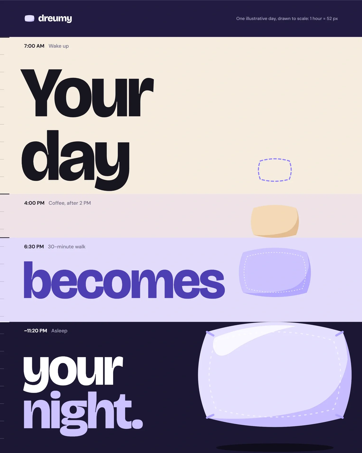
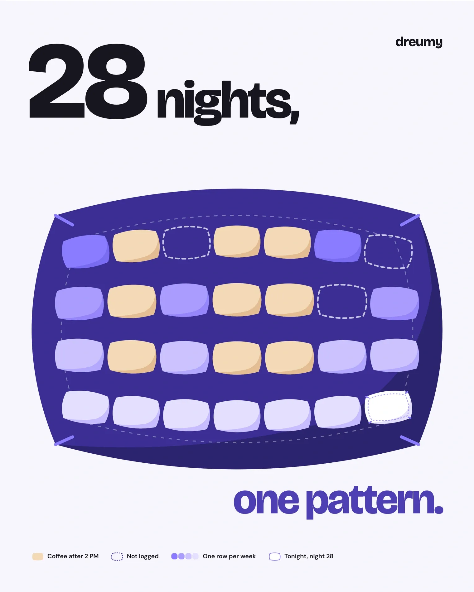
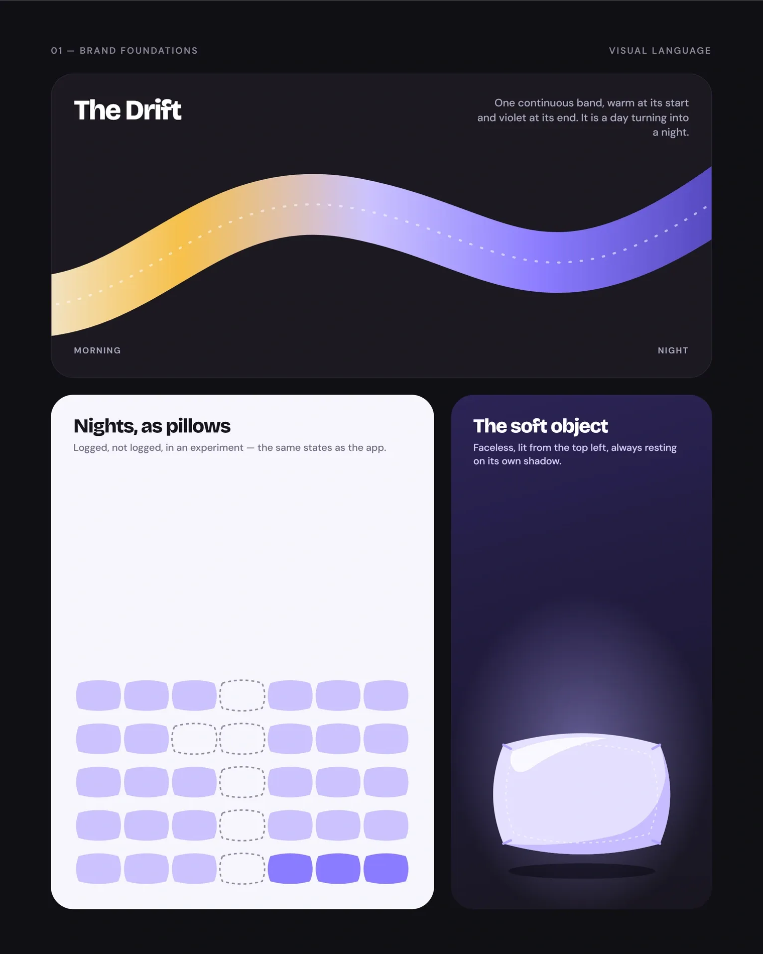
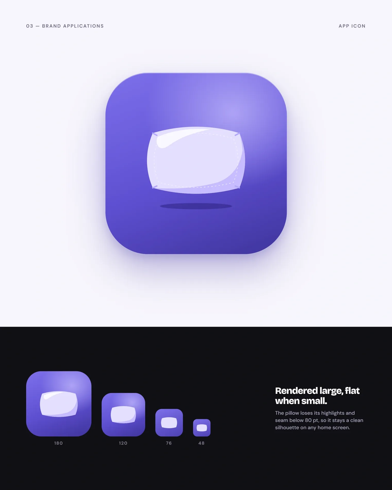
The identity is built around a soft, faceless pillow. It works as the brand symbol, as the app icon and as a unit of data: in the app, every logged night is a pillow.
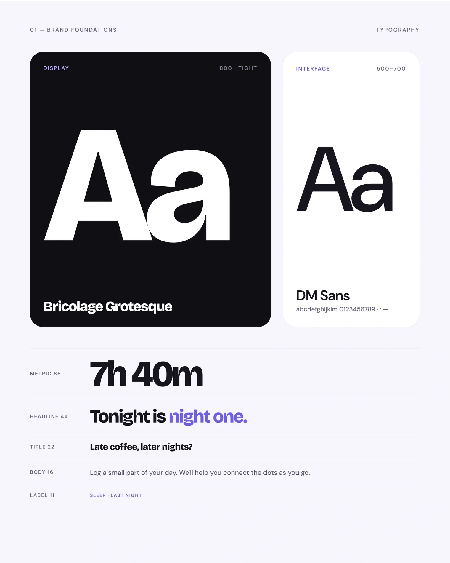
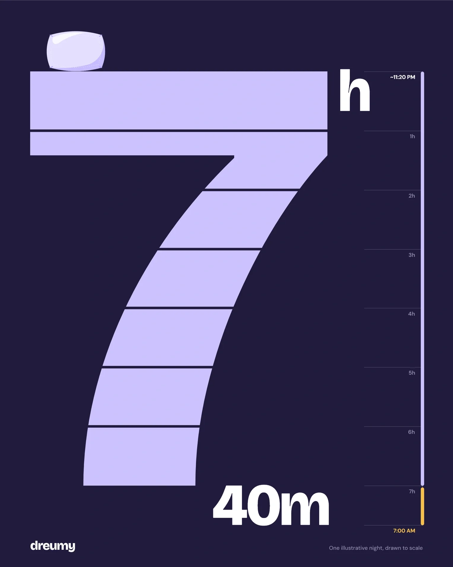
The wordmark and headlines use Bricolage Grotesque in a heavy, tightly set weight, with DM Sans for interface text. The system includes the symbol and wordmark, typography, a day-to-night colour palette and a series of brand posters.
Brand identity services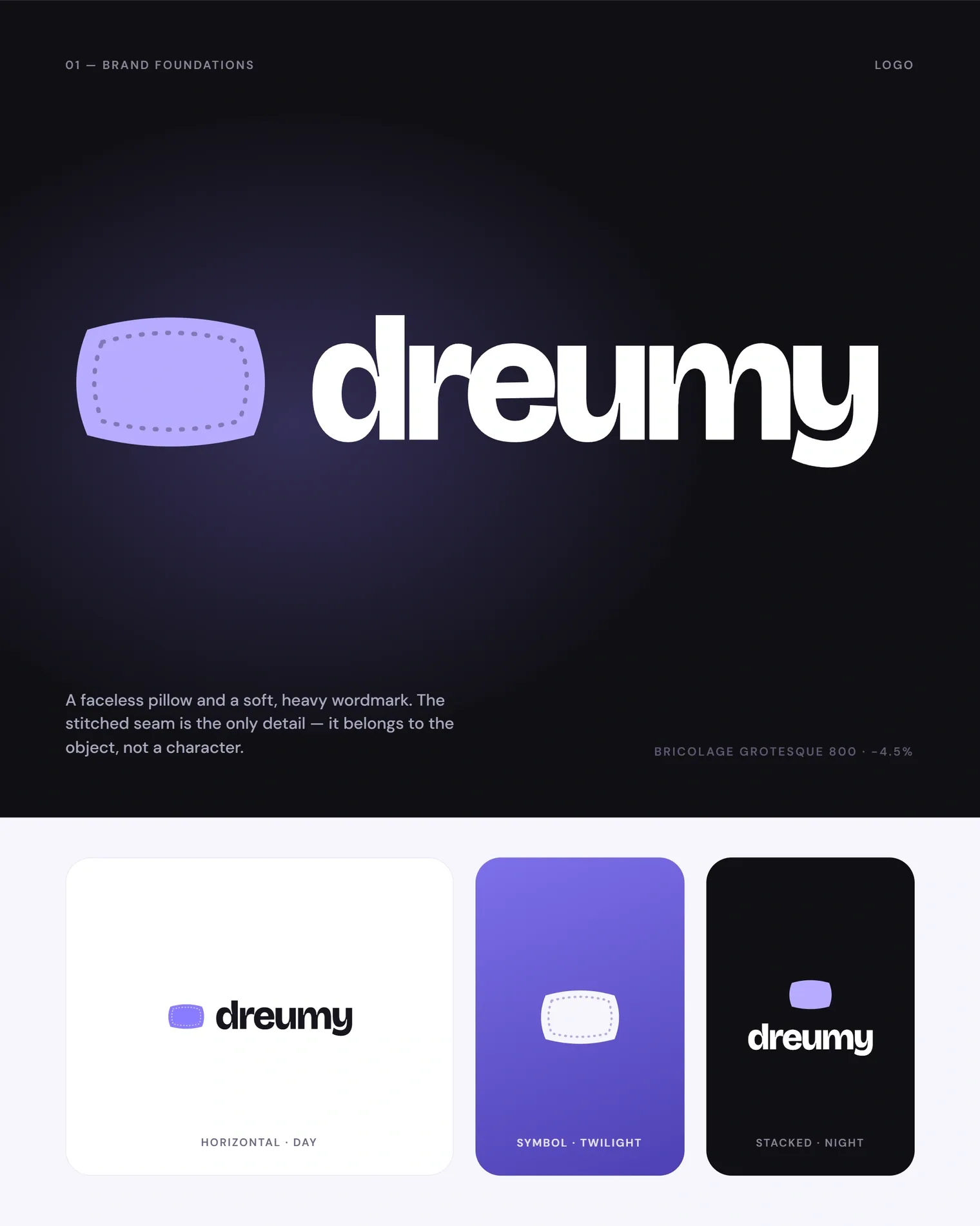
Visual System
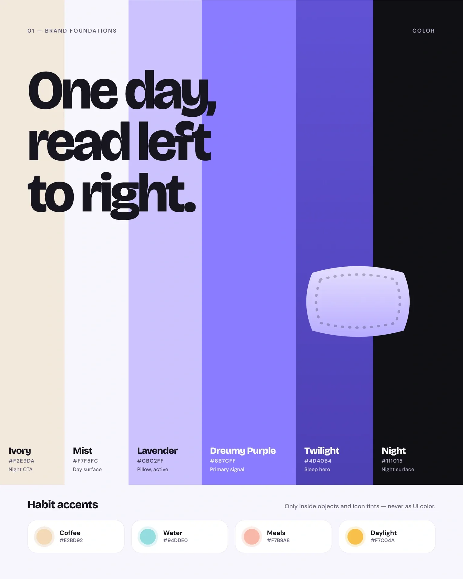
The palette reads like a single day: ivory and mist for the morning, lavender and Dreumy purple for the evening, twilight and night for sleep. Warm accents mark daily habits such as coffee, water, meals and daylight.
The pillow appears in a few defined states taken from the app: an outline for a night not yet logged, a flat fill for a logged night and a fully rendered form for key moments.
iOS App Design
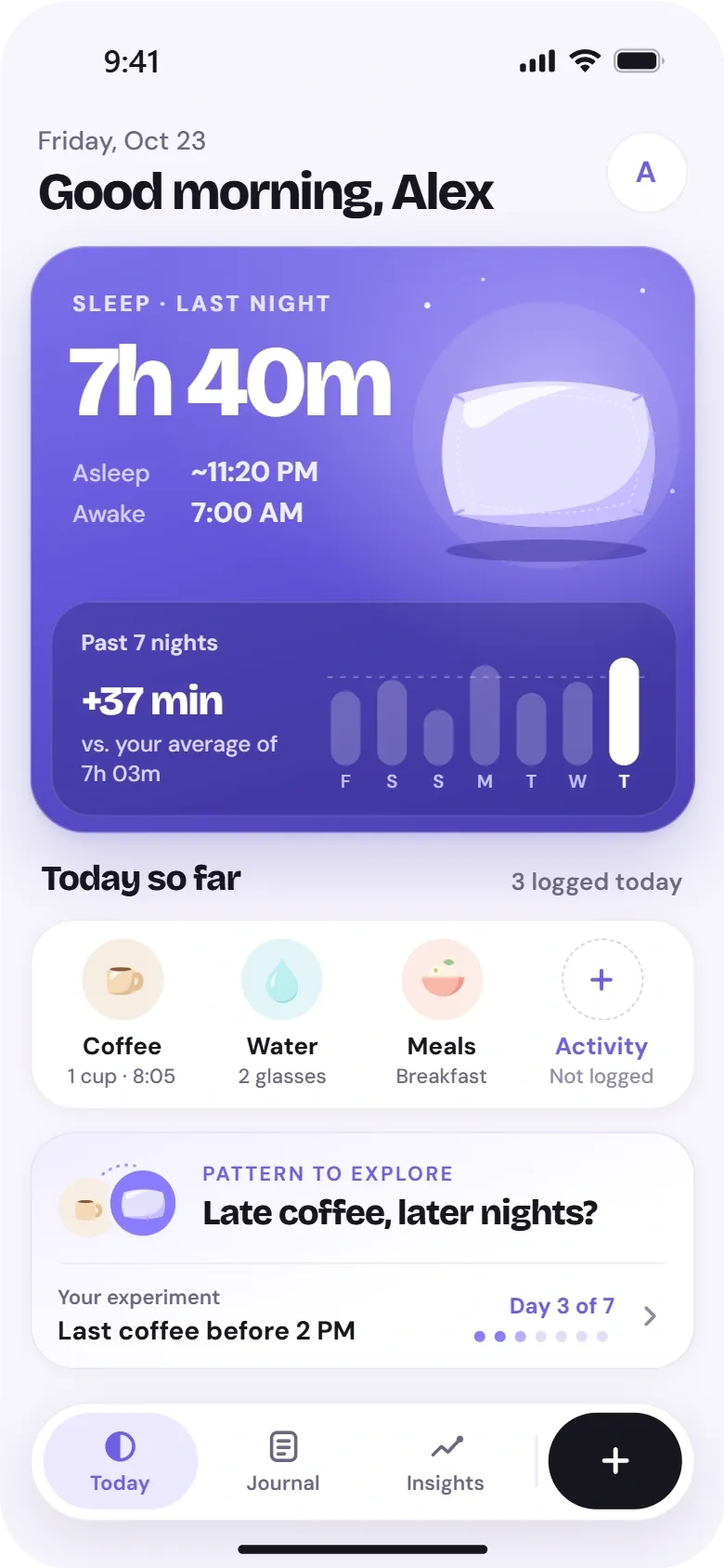
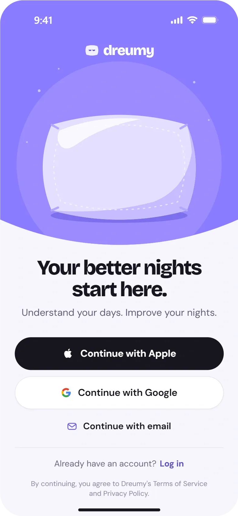
The app is organised around a single Today screen, with Journal and Insights as secondary tabs and a quick-log button always within reach. Onboarding introduces the idea in four short screens, and sign-in offers Apple, Google and email.
Screens follow familiar iOS patterns: large titles, cards with a clear hierarchy and a bottom tab bar. The pillow and the purple accents tie each screen back to the brand.
Product design services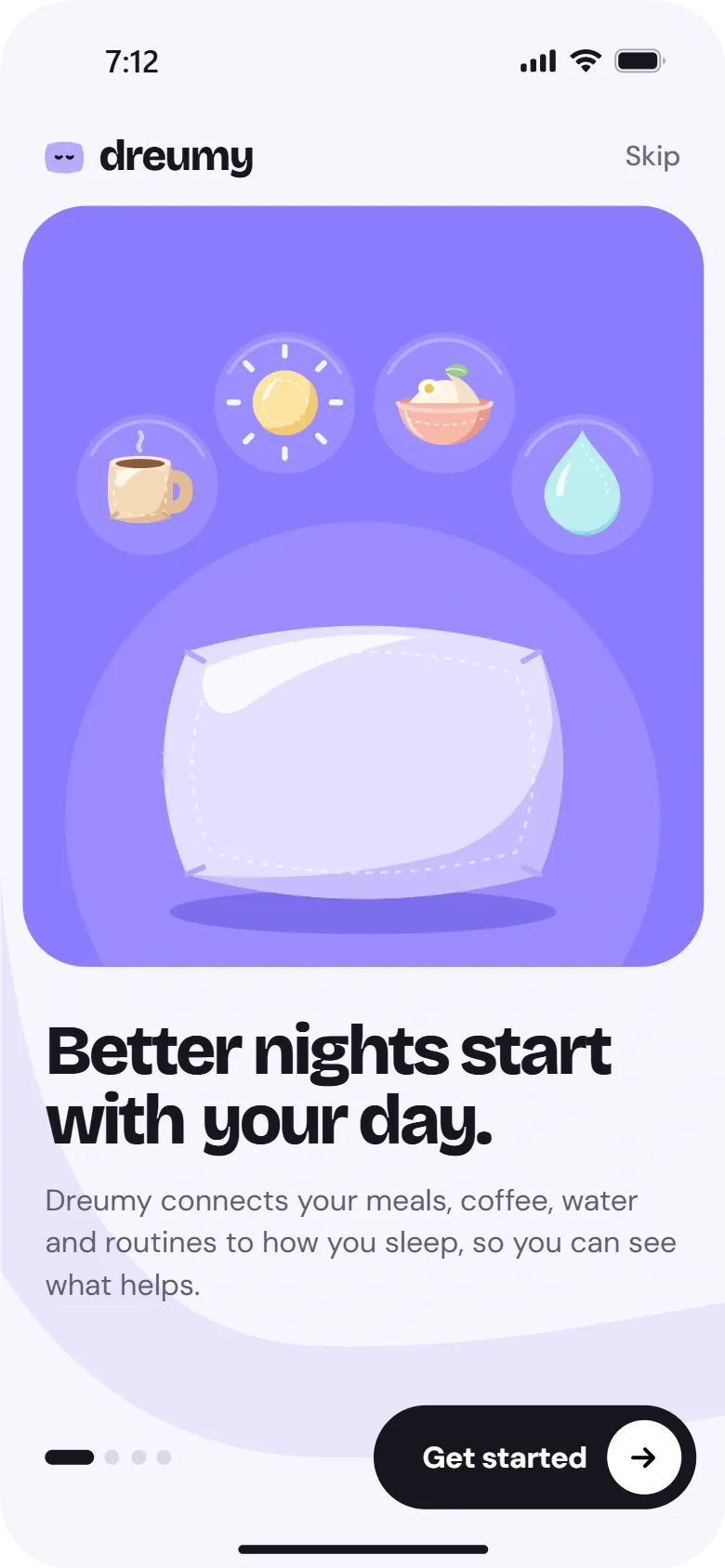
Daily Tracking and Sleep Insights
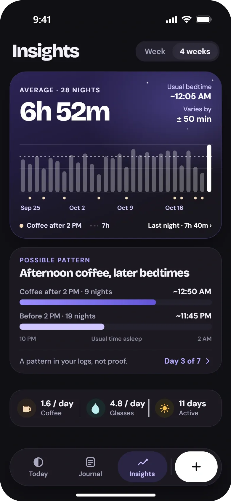
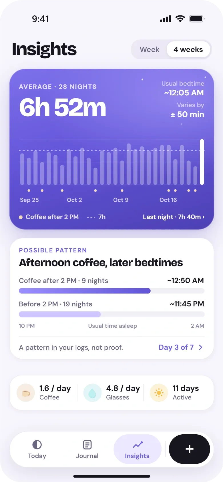
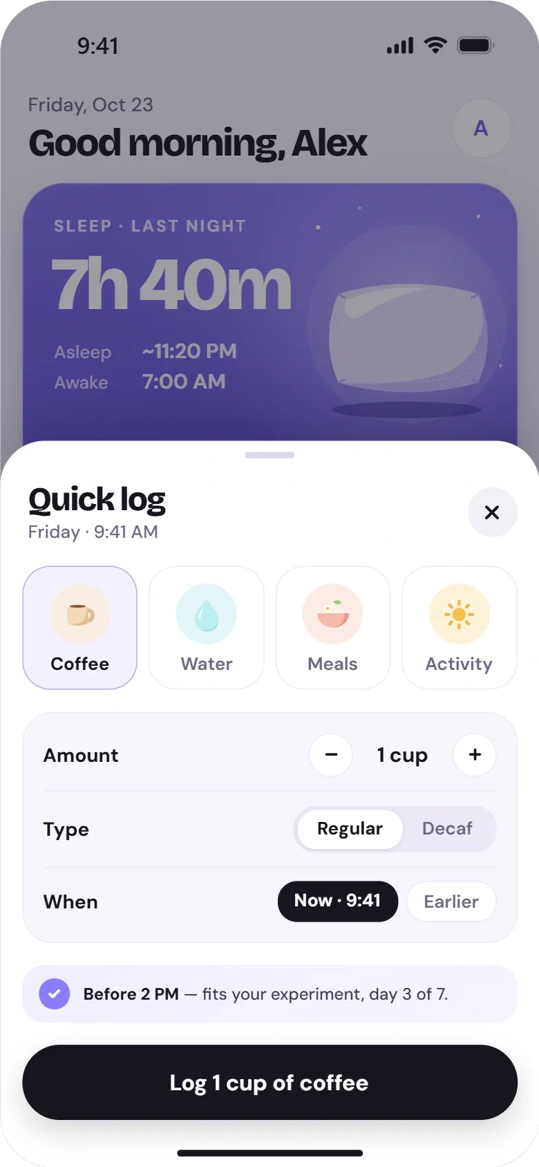
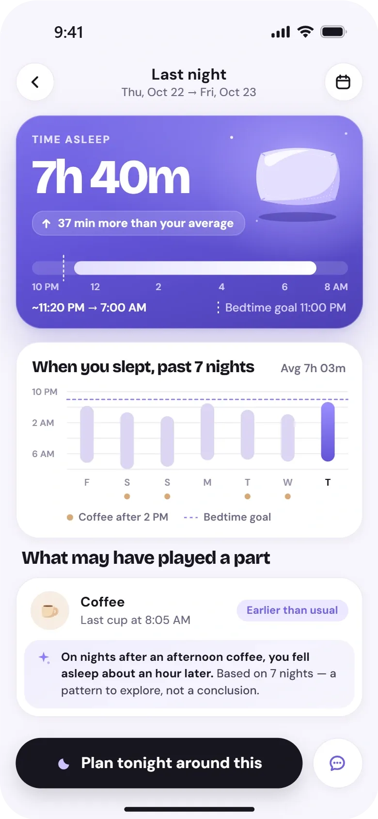
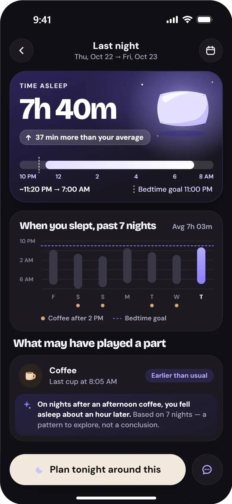
Today shows last night’s summary, the habits logged so far and one pattern to explore. Quick Log records coffee, water, meals or activity in a couple of taps. Insights compares nights across several weeks, and the sleep detail view sets a single night next to the day before it.
Values shown in the designs are illustrative. Patterns are framed as something to explore, not as conclusions.
Evening Guidance and Personalisation
In the evening the app moves from looking back to planning ahead. Tonight’s Plan turns a pattern into a few small steps around a bedtime goal. Sleep Coach is a designed chat interaction for questions about a routine, and Habits & Personalisation sets what is tracked and when reminders arrive.
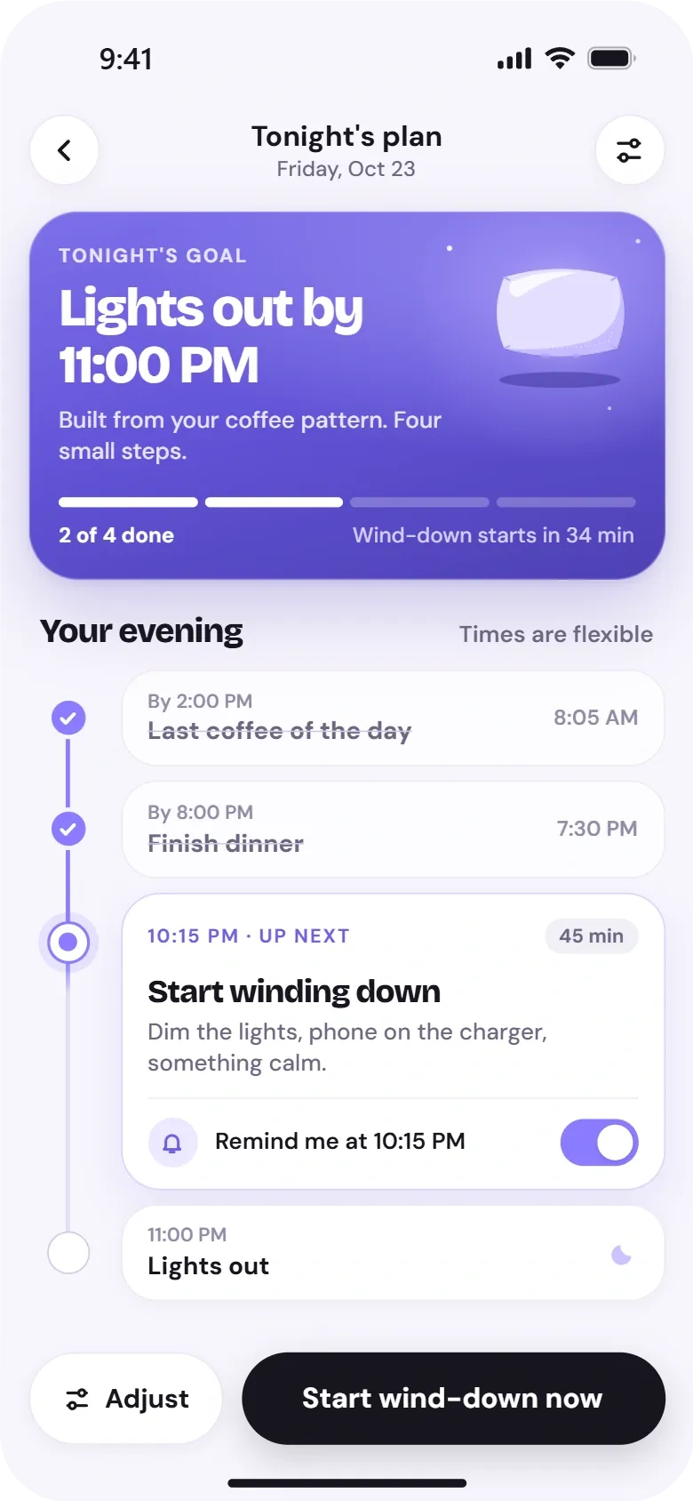
Tonight’s Plan
A bedtime goal and a short checklist for the evening, with reminders.
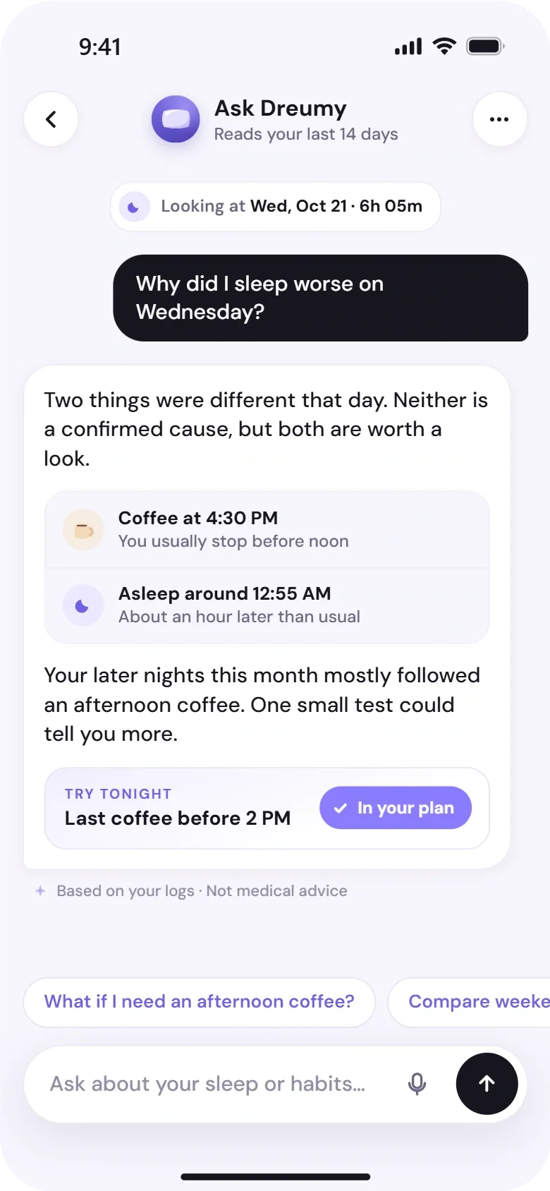
Sleep Coach
A conversational view for questions about a routine, with suggested prompts.
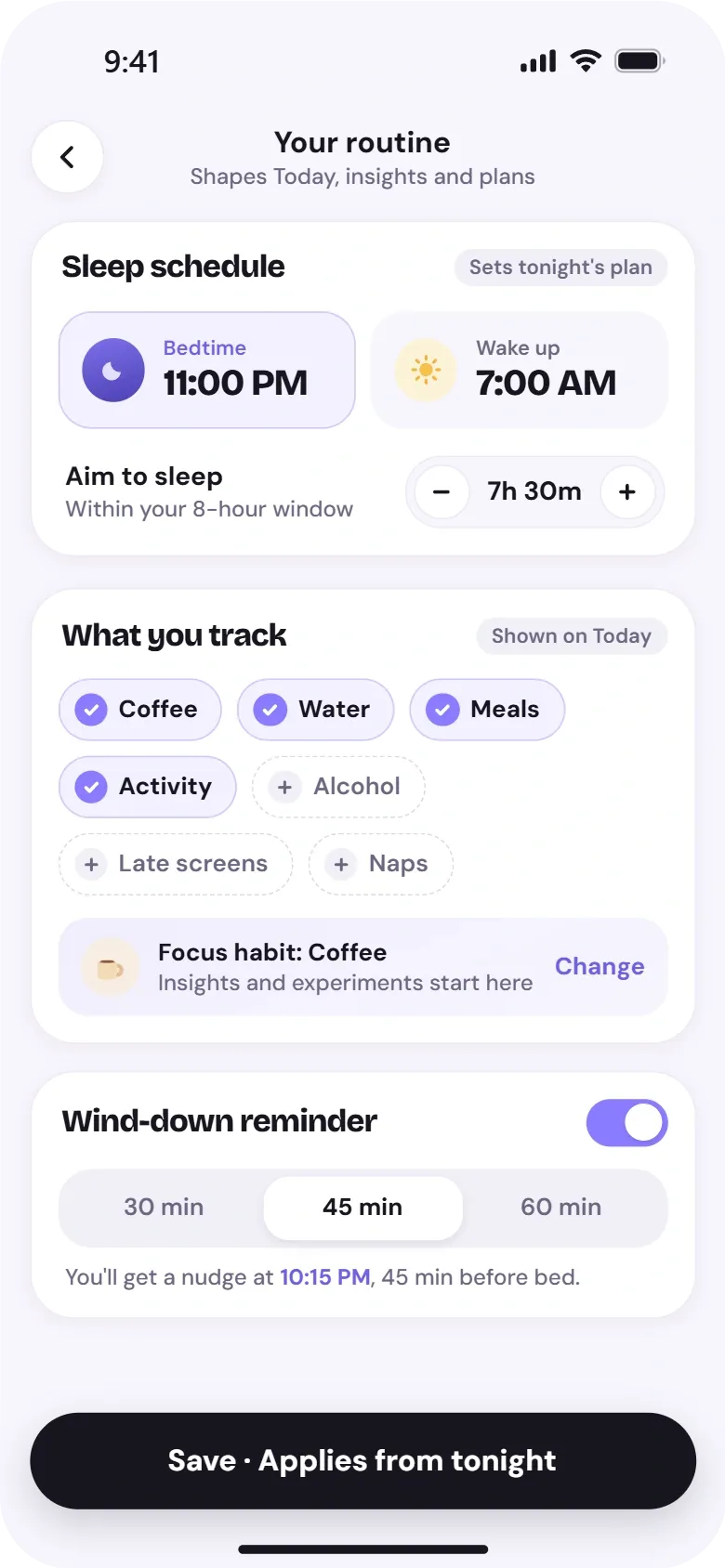
Habits & Personalisation
Choose which habits to track, when reminders arrive and which goals to keep.
Light and Dark Interfaces
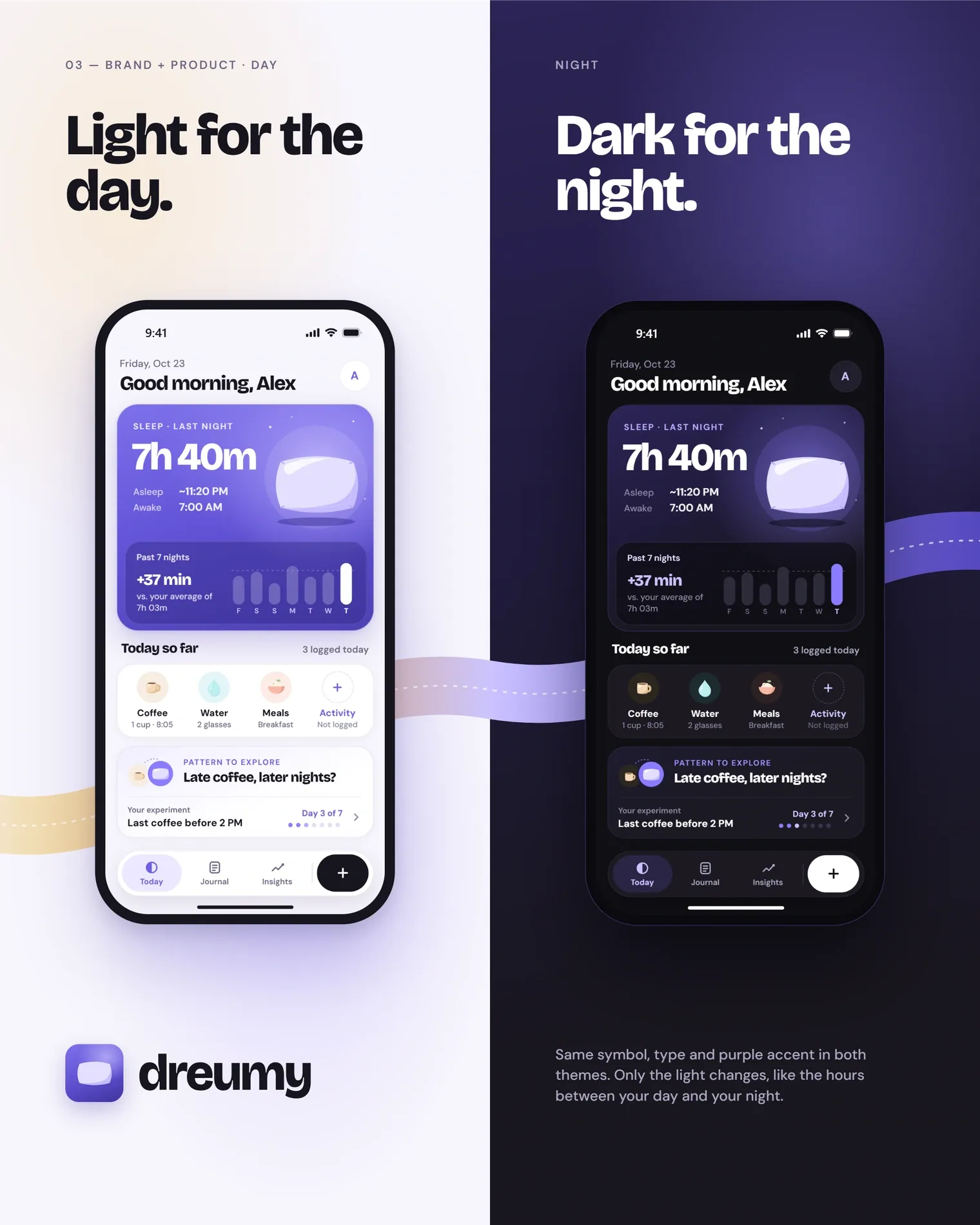
Every screen was designed in both themes from the same components. Layout, hierarchy and type sizes stay identical; only backgrounds, surfaces and text colours change. The purple sleep card, lavender accents and habit colours carry across, so a screen reads the same at 7 AM or at midnight.
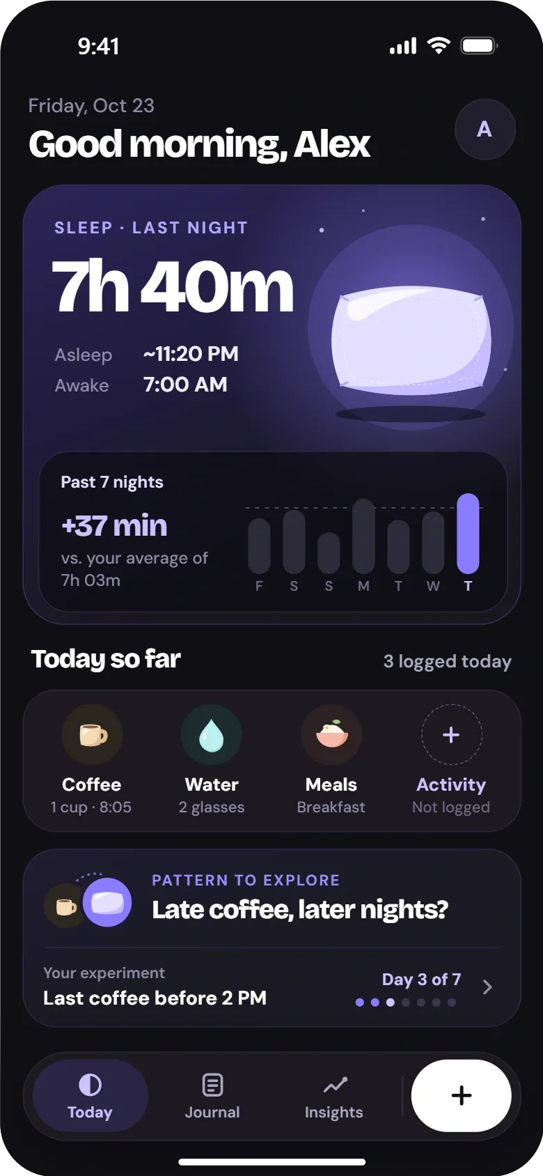
One identity across posters, icon and interface
The same symbol, type and purple accent appear in both themes. Only the light changes, from the day to the night.