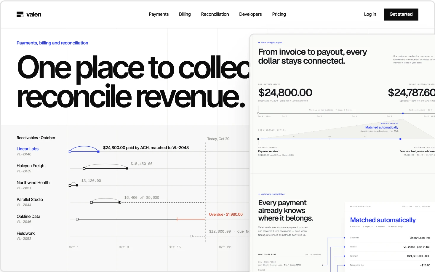
One proposition, not a feature list
Payments, treasury, lending and spend tools all have long feature lists. The first screen should state one clear outcome for one kind of buyer, then let the rest of the page prove it. Feature grids belong further down, for buyers who are already convinced.
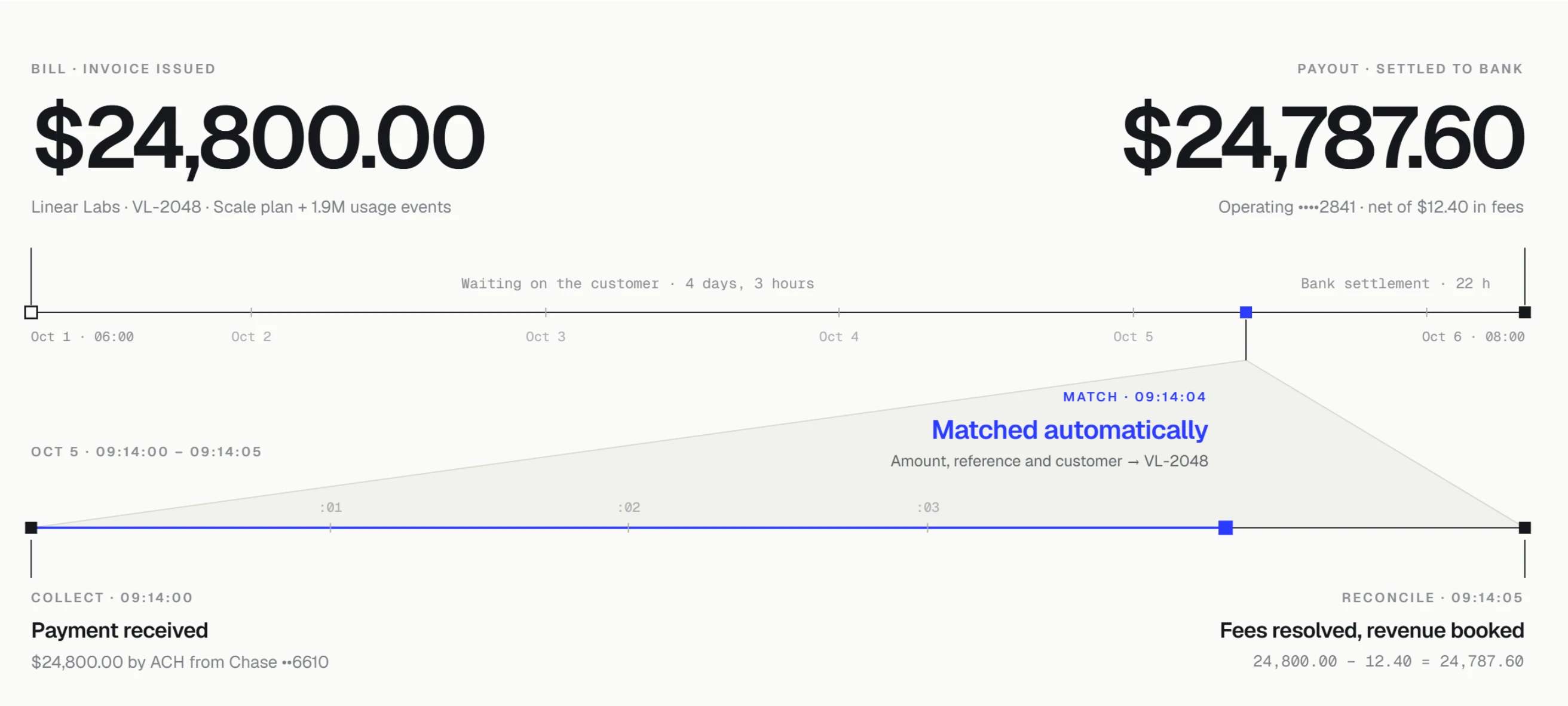
Make the money flow easy to follow
Buyers need to see where money goes: from invoice to payment to reconciliation, or from card to approval to ledger. Drawing that journey as one clear line explains the product faster than any paragraph.
Trust signals that are real
Security, compliance and data handling need clear, specific answers in plain language, placed where the buyer is deciding. Claims that cannot be verified do more harm than good, so the design gives real facts room to be read.
Numbers that read correctly
Financial interfaces live or die on how numbers, currencies, dates and statuses are shown. Tabular figures, consistent formats and clear states for pending, failed and completed are designed into the system, on the website and in the product.