Mingle: brand identity and marketing website design for a community intelligence platform.
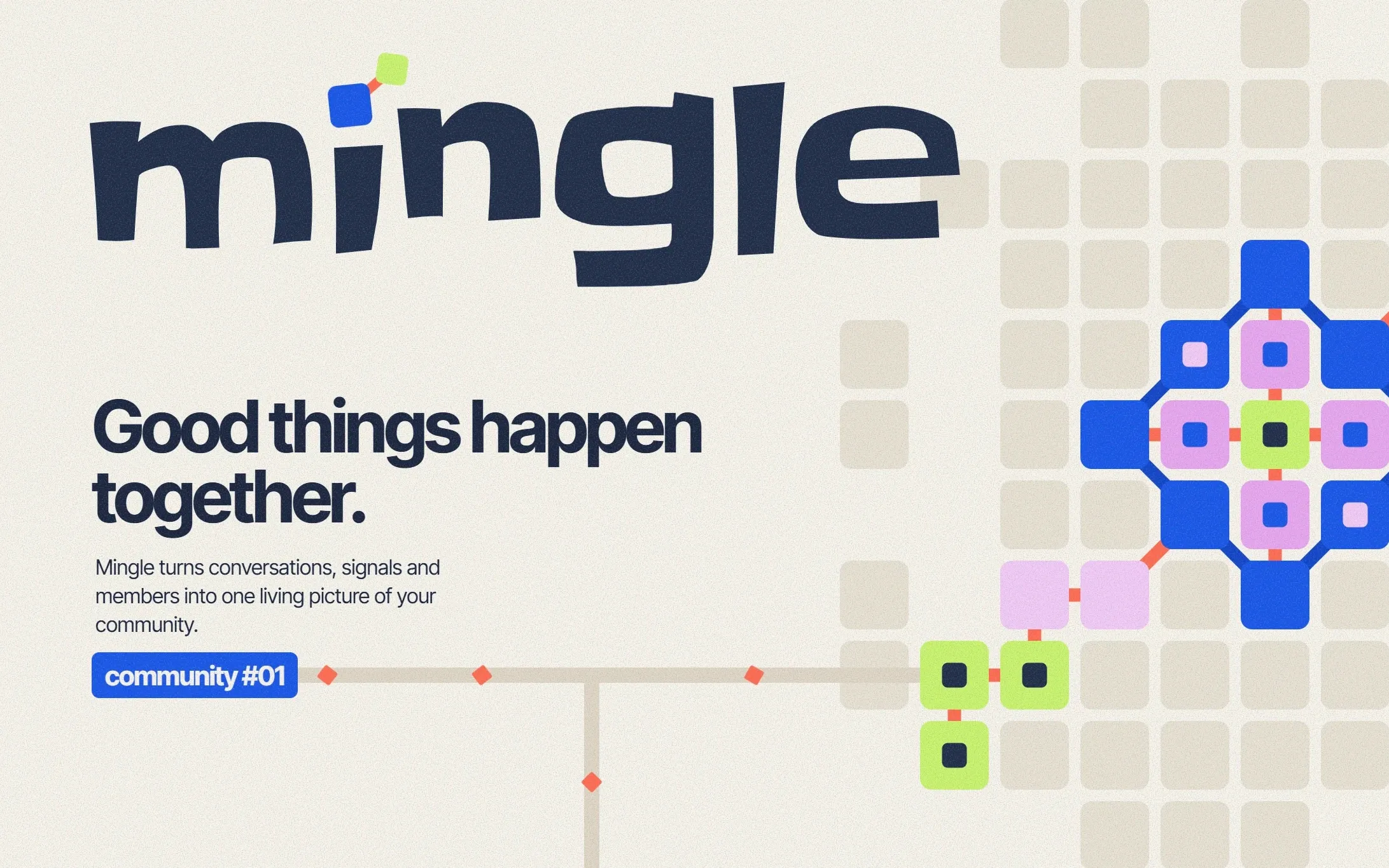
Mingle brings community conversations, people and activity together in one visual map. The project covers its brand identity, modular graphic system and marketing website.
Project overview
The work moves from identity to website. A modular graphic system sits at the centre of both, and it was explored in two colour directions. The Electric direction is the one applied to the marketing website.
Brand identity
Wordmark, typography and colour palette.
Modular graphic system
Tiles, connectors and labels used across every application.
Colour explorations
The same system in a warmer palette, alongside the Electric direction.
Marketing website
A six-section desktop homepage, with mobile layouts for sections 04–06.
Brand Identity
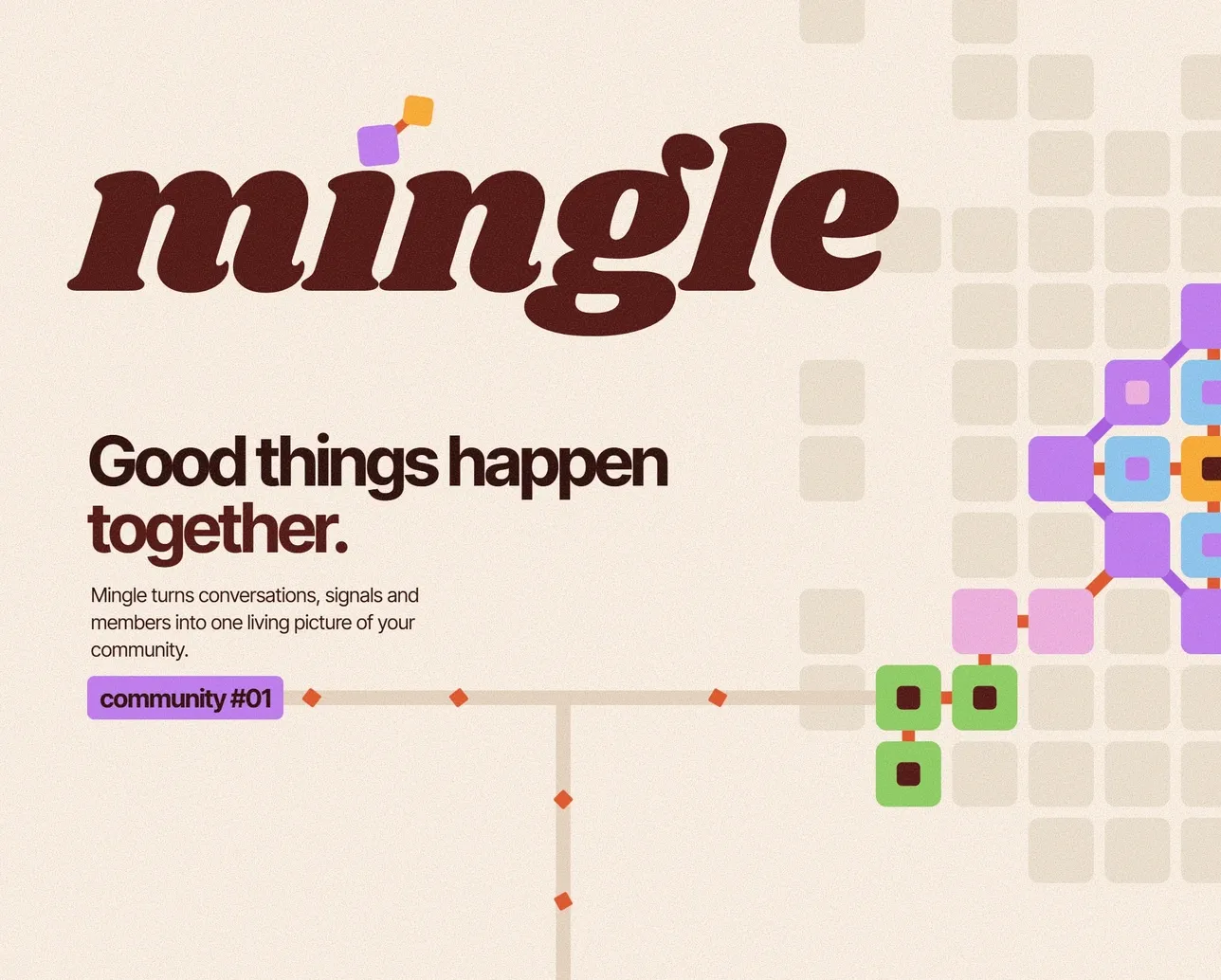
The wordmark is set in Slackey. The dot of the i is replaced by two connected tiles, the same unit the rest of the graphic system is built from.
Electric blue leads the palette, supported by navy, coral, lilac, lime and a warm off-white. Headlines are set large and tightly spaced in Inter Tight.
Brand identity services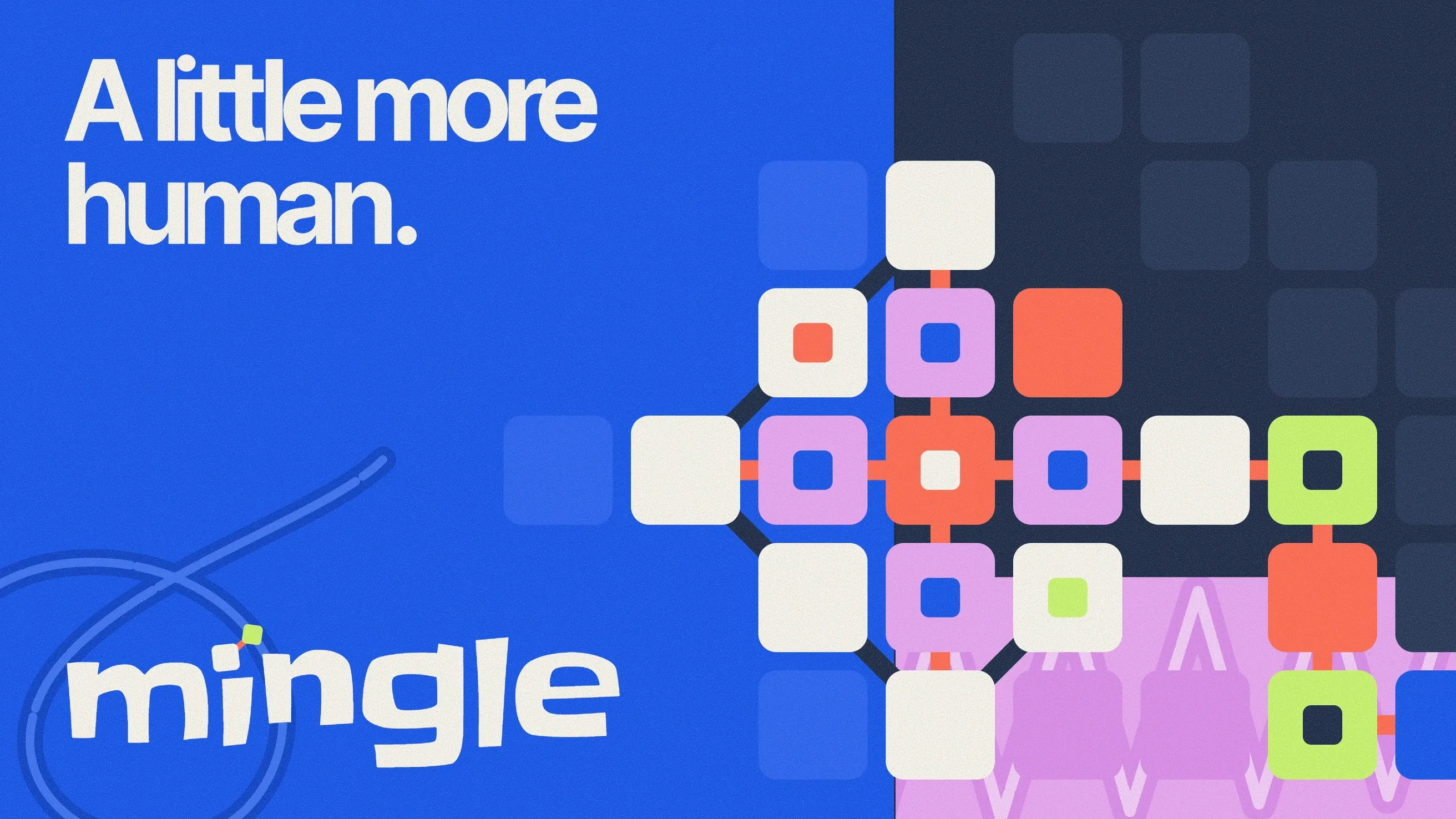
Typography
- Electric blue#1755E7
- Navy#202C46
- Coral#FF6B50
- Lilac#E7A5EF
- Lime#C9F36B
- Off-white#F7F3E9
Modular Graphic System
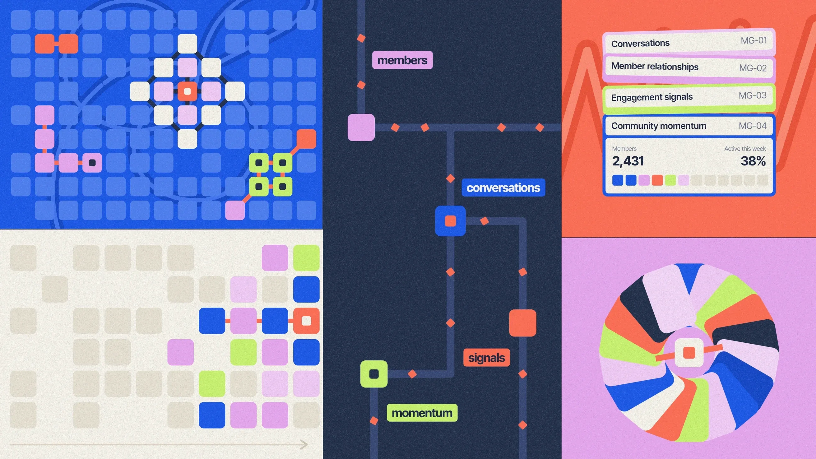
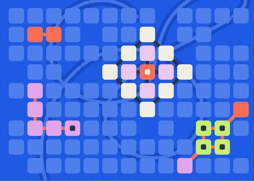
Everything is assembled from rounded square tiles placed on a grid. Tiles are joined by short connectors, grouped into formations and tagged with small label chips. Changing the colour, density and arrangement of the same parts produces very different compositions.
Tiles and formations
Filled tiles, tiles with an inset square, and muted tiles that form the background grid.
Routes and connectors
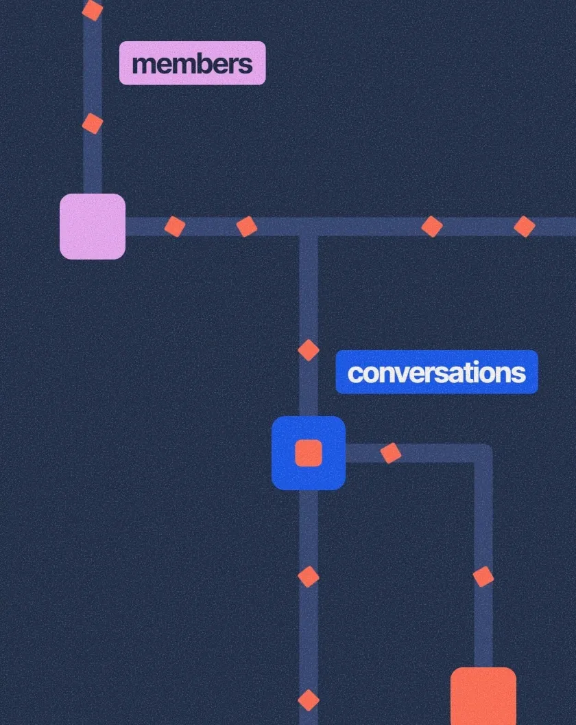
Coral links and diamond markers join tiles into paths, like threads between people.
Label chips
Short words (members, conversations, signals, momentum) set on solid colour blocks.
Larger figures
Stacked cards, a momentum field and a conversation wheel built from the same tile shape.
Colour Explorations
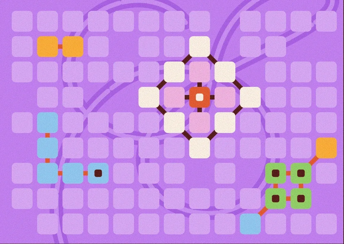
The same modular system was also explored in a warmer palette: burgundy, cream, violet, orange, sky blue and green. The compositions, formations and type stay the same; the colours change, and the wordmark is set in the heavier serif Shrikhand.
These are explorations. The Electric direction is the one used on the marketing website.
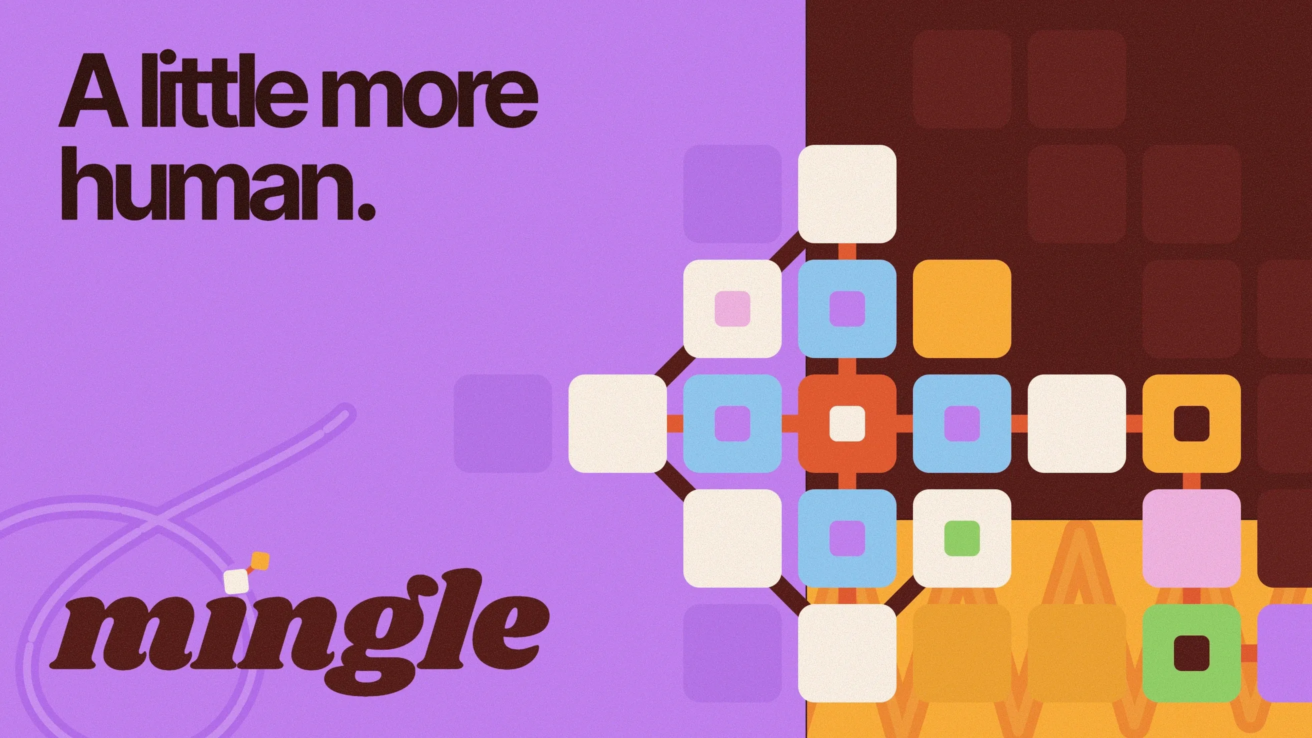
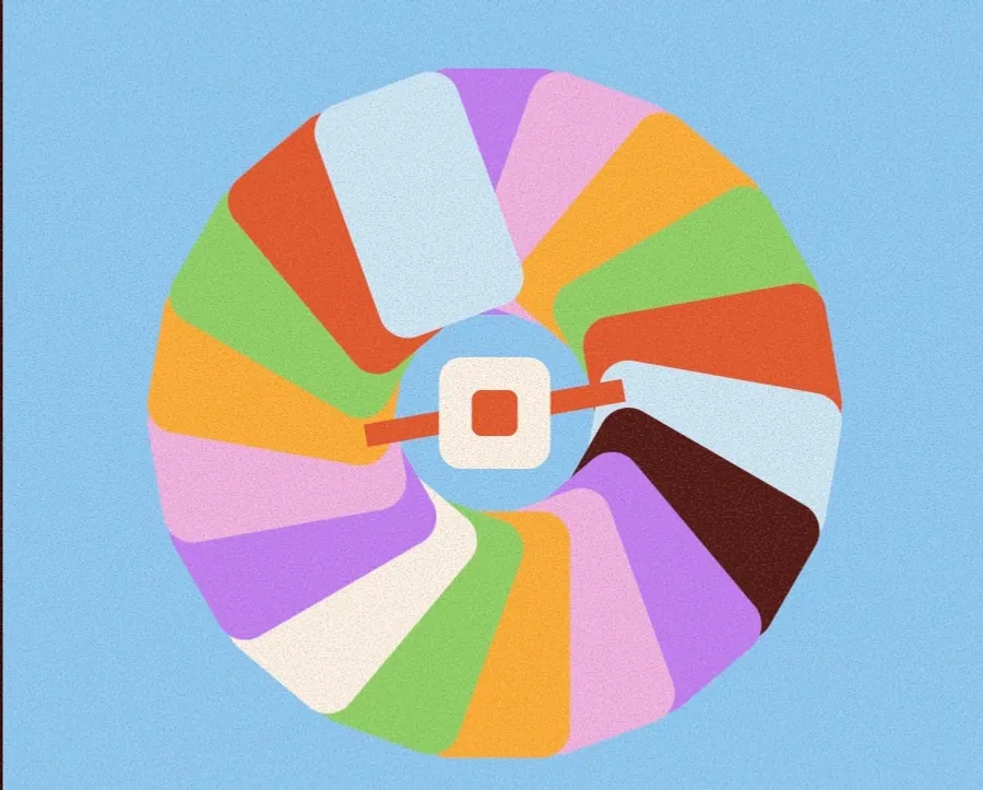
Brand expression, brand world and conversation wheel in the warm palette.
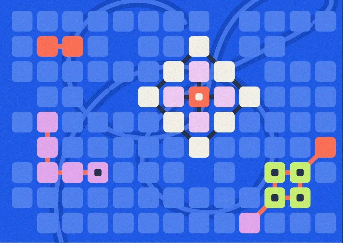
One formation, two palettes
The same formation library from the graphic language, shown in the warm exploration and in the Electric direction.
Brand Applications
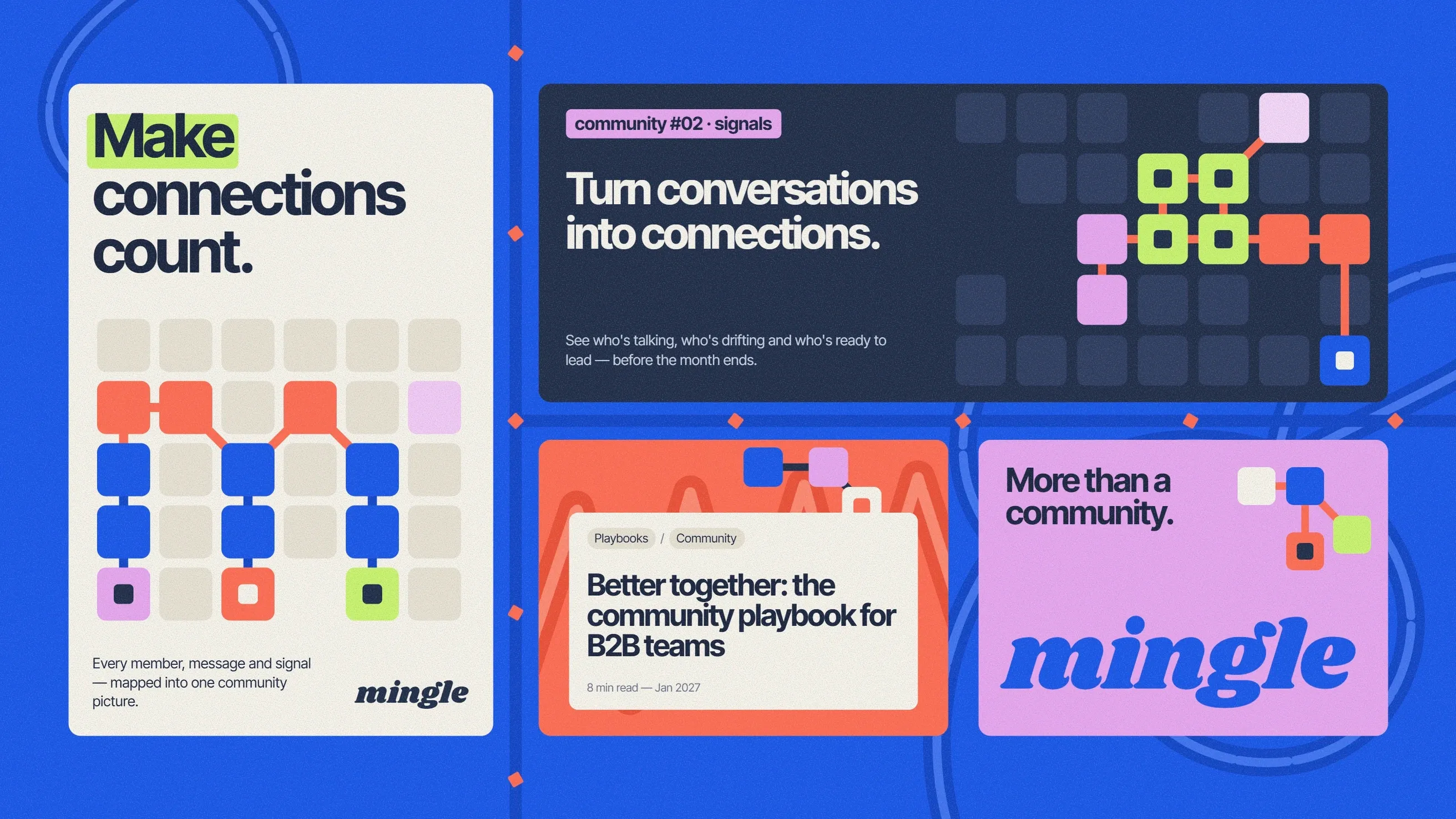
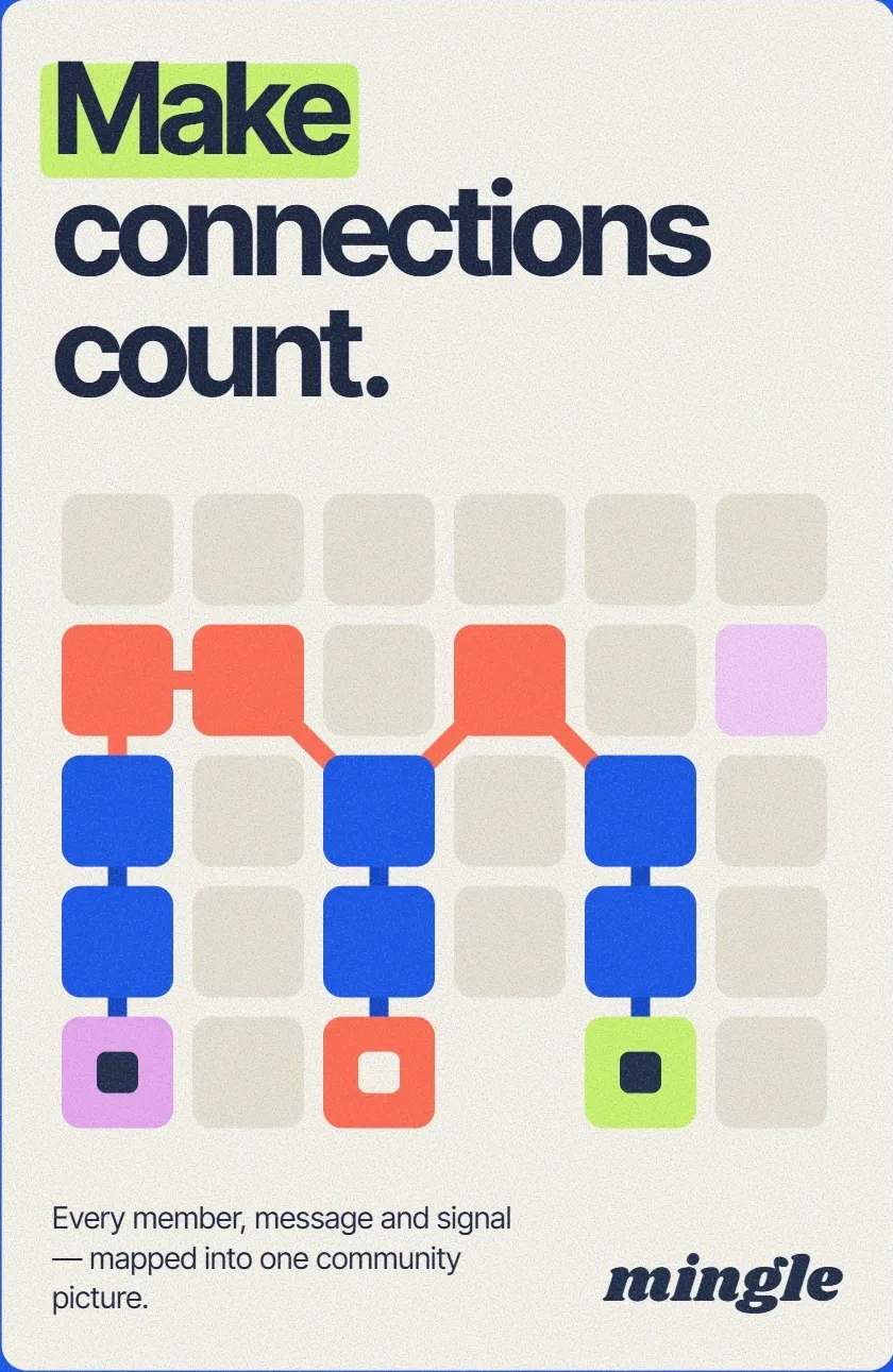
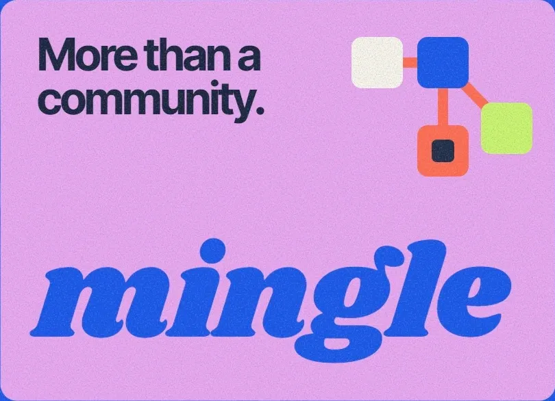
Back in the Electric palette, the system is applied to a poster, a banner, an editorial card and a brand card. Tile formations carry the illustration, label chips mark the topic, and headlines take the largest share of each layout.
In these layouts the wordmark is set in the serif Shrikhand, a second version of the logotype used next to the main Slackey wordmark.
Marketing Website Design
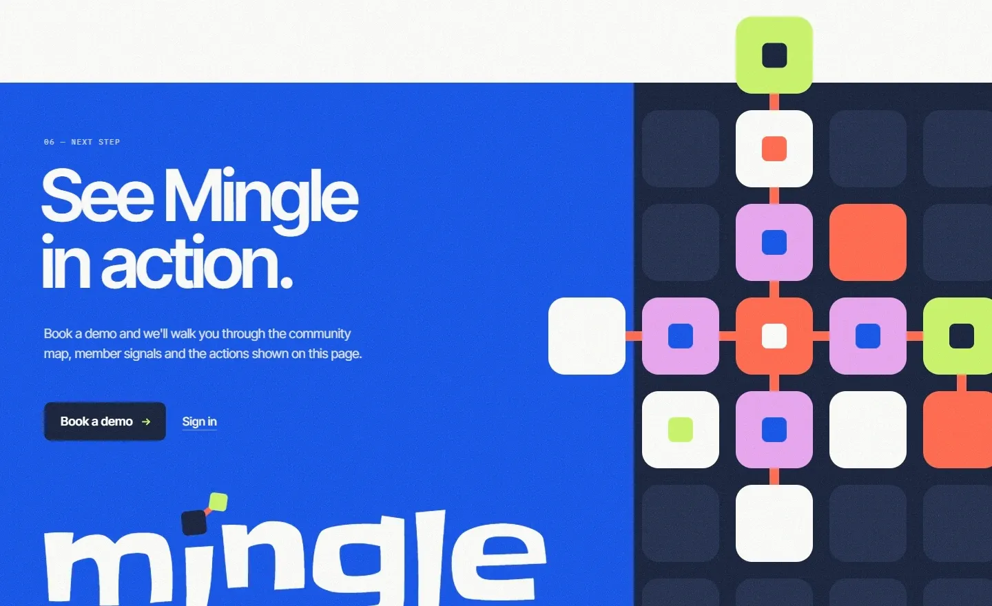
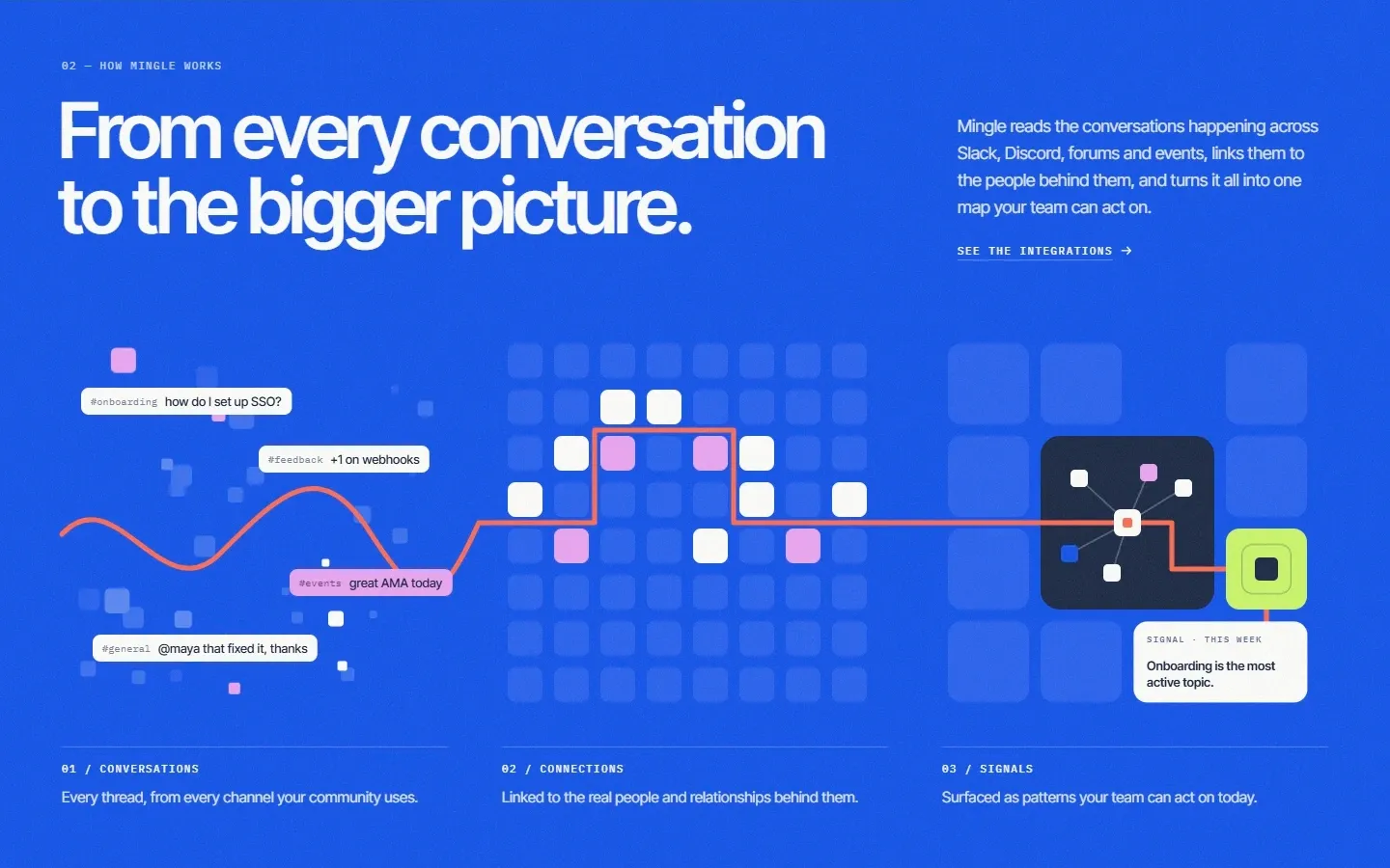
The homepage introduces Mingle, shows how community activity becomes a map, presents the product interface, follows one conversation through the product, lists its core capabilities and ends with a request for a demo.
The layout borrows directly from the brand: tiles form the hero graphic and the community map, coral connectors draw the routes, and the Electric blue section marks the change from introduction to explanation.
Web design services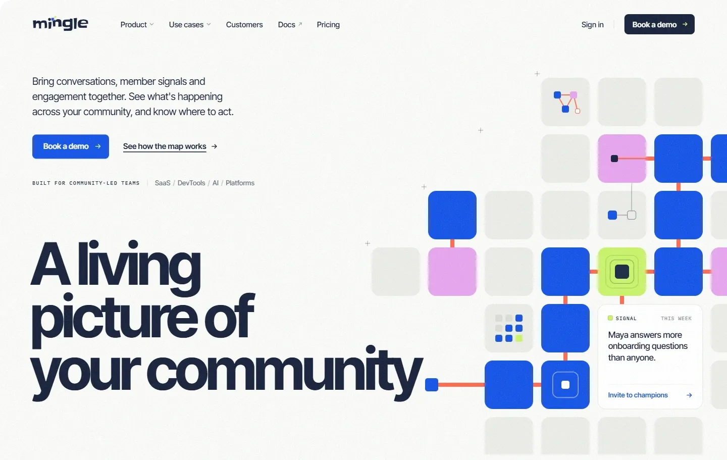
Product presentation
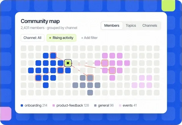
The homepage shows the product interface at full width, framed in lilac. The example workspace shows a community map grouped by channel, with one member selected.
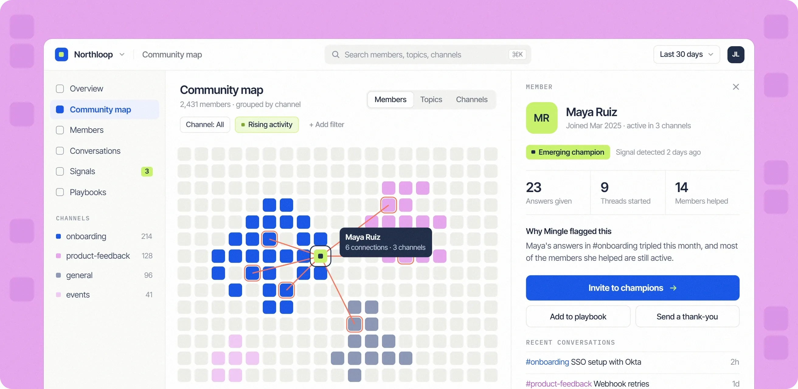
Community map
Members drawn as tiles and grouped by channel, with filters for channel and rising activity.
Connections
Selecting a member draws coral lines to the people they are connected to.
Member panel
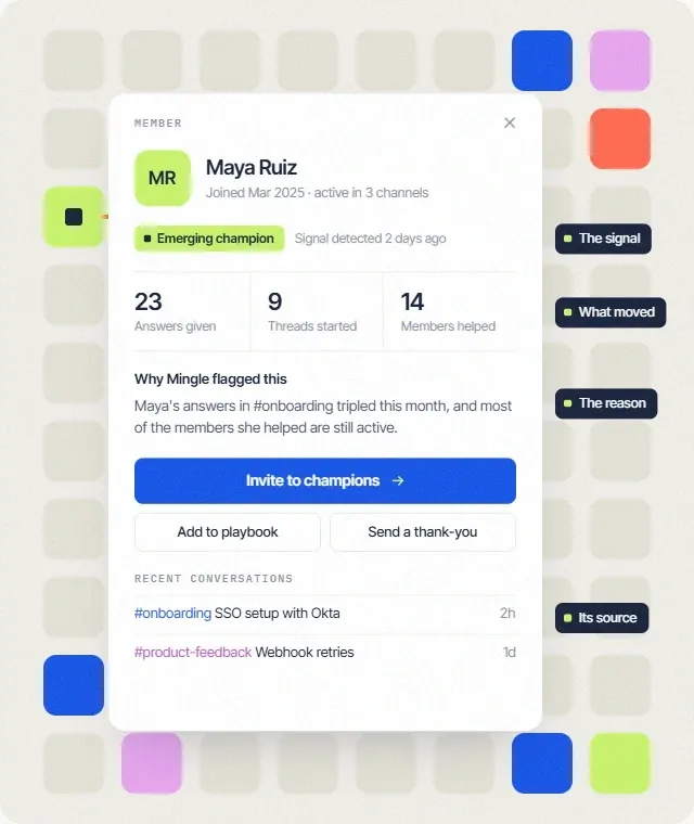
Why the member was flagged, recent conversations and actions such as inviting them to a champions group.
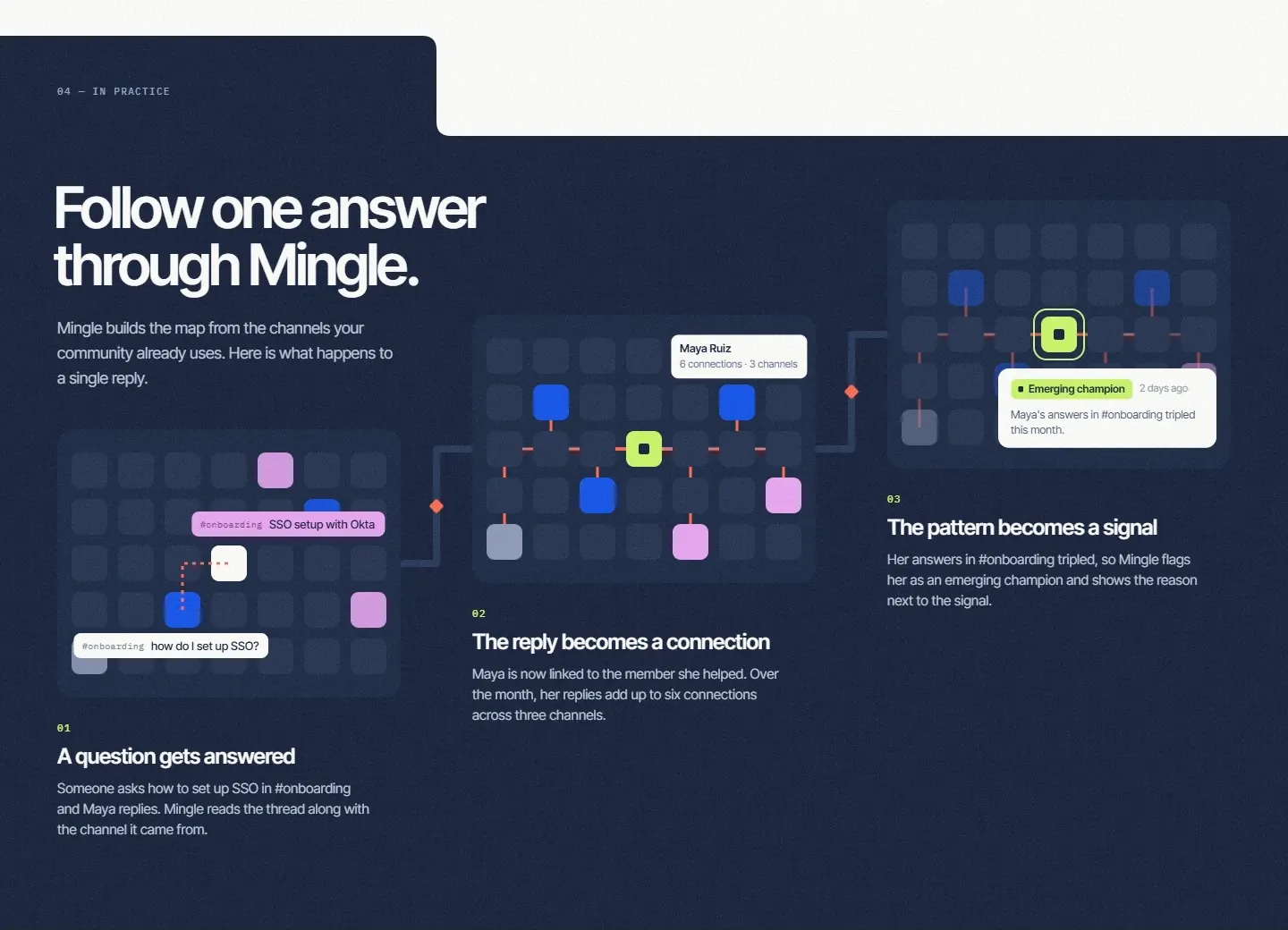
Product capabilities
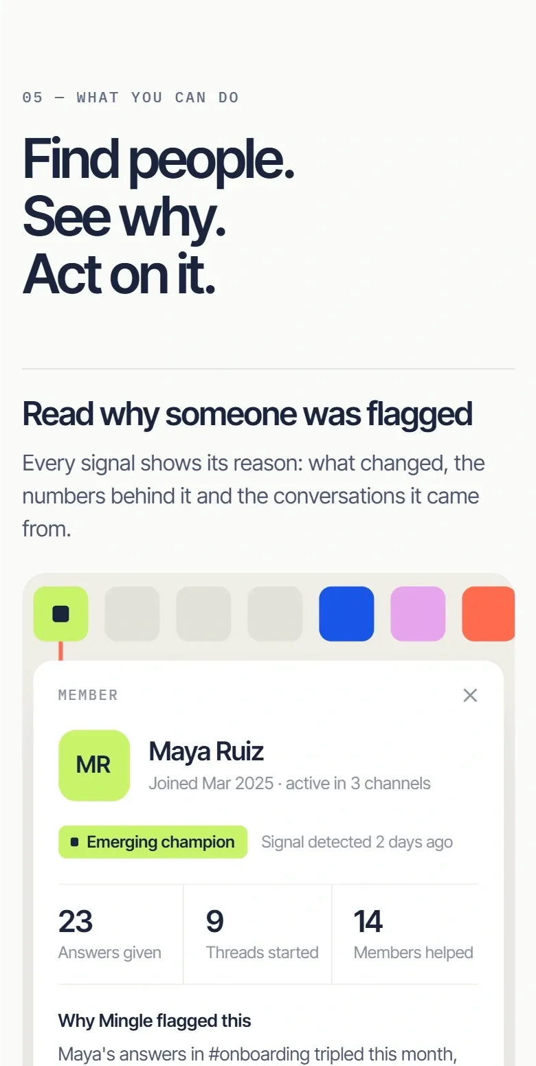
Under the heading “Find people. See why. Act on it.”, the section presents three capabilities. Two of them are shown here at close range.
Responsive Design
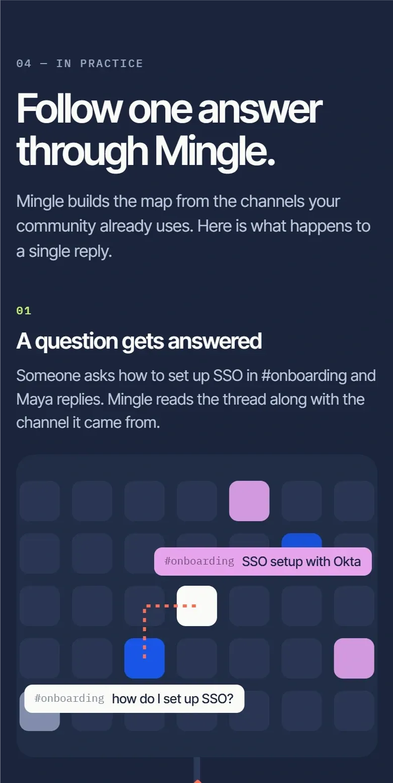
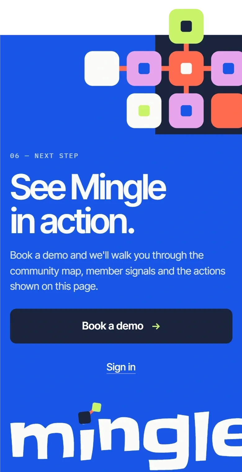
Mobile layouts were designed for the last three sections of the homepage. The three-step route in “In practice” is stacked vertically, each capability is followed by its interface card at full width, and the closing call to action keeps the tile composition above the headline.
One visual system from brand to website
The closing section of the homepage brings the parts together: Electric blue, a tile formation with coral connectors, Inter Tight headlines and the Slackey wordmark set at full width.